
Packaging is the first product you actually buy. Before any object reaches your hand, the box has set an expectation about quality, price, and category. Almost every detail of a box has been considered by people whose job is to convince you that the contents are worth the asking price. None of this is dishonest in itself. The work is real and skilled. But understanding how packaging operates changes the experience of standing in front of a shelf.
Weight does not have to mean quality
A surprising amount of premium packaging is heavier than the product alone requires. Brands add weight intentionally because consumers associate heft with value. A phone in a thin paperboard sleeve feels disposable. The same phone in a magnetised, weighted box feels like an heirloom.
This is not always a trick. A heavier box can protect the product better during shipping and storage. But the weight is a signal as much as a function, and learning to notice the difference is the first step in seeing packaging more clearly.
The colour of premium
Different categories have evolved different visual codes for premium status, and they are remarkably consistent within each one. Skincare often uses white and pale blush tones with one accent metallic. Audio gear uses deep matte black with copper or silver. Wellness uses cream, sage, and clay tones with thin sans-serif type.
The codes are so consistent that a brand can step into a category and signal premium status before saying a single word about the product. The shopper who recognises the code can read the intent without falling for it, which is the calmer place to stand.
Typography that suggests heritage
Established brands often use serif typefaces with traditional letterforms to suggest a long history, even if the company is six months old. Spacious, restrained typography in single weights conveys confidence. Crowded layouts with multiple weights and exclamation marks suggest budget pricing or value tier.
These conventions are not laws. Plenty of premium products use bold sans-serif type and plenty of budget products use elegant serifs. But the conventions are consistent enough that you can predict the price band of a product from the type treatment alone with surprising accuracy.
Words that signal class
Certain phrases recur in premium packaging across unrelated categories. Crafted, considered, artisanal, hand-finished, small batch, refined. Each phrase suggests human attention rather than industrial scale. None of them have legal definitions, so any product can use them.
On the budget tier, the language shifts. Value pack, family size, original, classic, ultra, new and improved. These phrases signal convenience and familiarity. Neither set of words is dishonest. They are conventions that have become shorthand for price band.
- Premium signals: crafted, considered, refined, small batch
- Budget signals: value pack, original, ultra, classic
- Mid-market often uses: trusted, everyday, made for, fits
- Wellness category: gentle, clean, balanced, sustainable
The unboxing as performance
In the past decade, packaging design has been quietly shaped by the rise of unboxing videos and product photography on social media. Premium boxes now include layered reveals, custom inserts, and almost ceremonial moments. A new pair of headphones may sit on a velvet pad. A phone may emerge from a sleeve that lifts away in a single satisfying motion.
This packaging serves the consumer who shares the moment as much as the consumer who owns the product. Brands invest in these reveals because they generate millions of impressions when shared. The buyer is part of the marketing system, often without realising the role being offered.
Reading a box without falling for it
None of this means premium packaging is bad. A well-designed box can be a pleasure. The point is to understand what the box is telling you and to separate that signal from the actual product inside.
Before any purchase, look at the product without the packaging. Read the spec sheet. Imagine the product in your home, away from the showroom lighting. The packaging may be exquisite, but you are not buying it. You are buying what is inside, and the inside is what will be with you in five years.
Closing thoughts
Packaging is a craft, and like all crafts it can be enjoyed without being persuaded by. The next time a box arrives, take a moment to notice what it is doing. The weight, the colour, the type, the language, the reveal. Each of those elements is talking to you.
Once you can hear that conversation, you can decide whether to join it on its own terms. That decision is what calm shopping looks like.
The maths quietly hidden inside premium packaging
A basic paperboard sleeve for a small consumer electronic runs the brand somewhere in the range of 40 to 90 cents. A magnetised rigid-set-up box with foam insert, ribbon pull and printed inner liner runs closer to 4 to 9 dollars, roughly ten times the material cost. On a 300 dollar product the difference is invisible in the shelf price. On a 60 dollar product the packaging can account for 8 to 15 percent of the price paid at the till.
Brands do not spend that money by accident. Consumer testing repeatedly finds that shoppers rate the same product 15 to 30 percent higher on perceived quality when it arrives in a heavier, more layered box. That perception then supports a small but steady price premium, which more than pays for the packaging over the lifetime of the product line.
| Packaging element | Approximate cost | Perceived signal |
|---|---|---|
| Paperboard sleeve, single colour | 0.40 to 0.90 USD | Everyday, functional |
| Printed folded carton with tray | 1.20 to 2.50 USD | Mid-market, gift-ready |
| Rigid set-up box with foam insert | 4.00 to 9.00 USD | Premium, keepsake |
| Magnetised lid, ribbon pull, printed liner | 7.00 to 14.00 USD | Luxury, ceremonial |
Reading this table before a purchase helps separate the box from the object. The underlying pattern is that packaging cost scales with a product’s price ambition, not with what the product actually needs to reach the buyer intact.
How the pattern escalates in gift categories
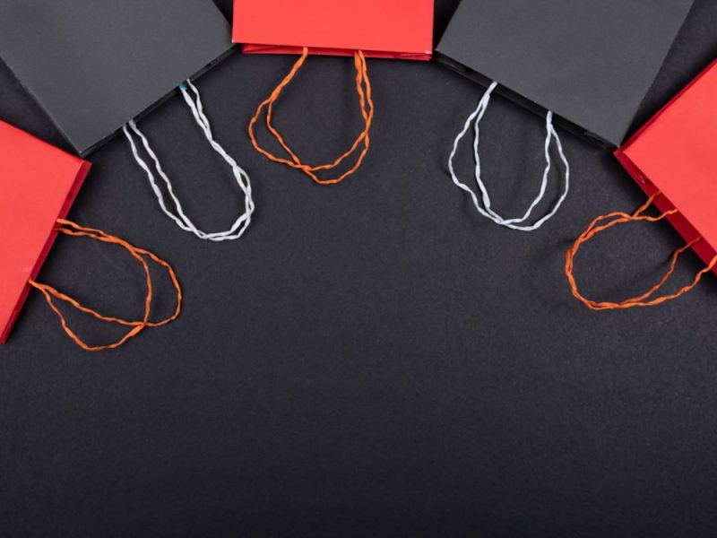
Gift-oriented categories such as fragrance, small leather goods, chocolate and premium spirits push packaging further than almost any other retail area. A 40 dollar bottle of eau de toilette may arrive in a printed carton that is itself wrapped in cellophane, tied with ribbon, and slipped inside a shopping bag with stiffened handles. Each layer adds a few cents to a few dollars in cost and adds several seconds to the perceived reveal.
The escalation runs on a simple logic. A gift is judged by both the giver and the receiver. Every added layer signals care and cost. Brands that skimp on gift packaging lose sales during the peak weeks around holidays and anniversaries, even when the product inside is identical to a plainer everyday version.
Shoppers can read the escalation quietly. Look for three tells. The first is a sleeve that adds no protective value but frames the box. The second is an inner tray that lifts the product upward as the lid opens, which is called a presentation motion in the trade. The third is any component that is thrown away within the first minute of use, such as a stiffened bow or a printed dust cover.
For readers who want to keep exploring the shelf language, the pieces on how the word natural signals without defining anything, the visual language of sustainability on packaging, the pricing logic behind limited editions and the numbers that make products sound scientific each cover one adjacent trick.
Frequently asked questions
Are premium boxes always wasteful?
Often, yes. The weight and materials used to convey premium status add to shipping emissions and landfill volume. Some brands have started to redesign with lighter, recyclable materials while preserving the feel of quality.
Why do some inexpensive brands use premium-looking packaging?
Because consumers respond to it. A budget product with premium packaging can sell at a small price premium, which more than covers the extra packaging cost.
How can I tell if I am paying more for the box than the product?
Compare the price of the same product in basic and premium packaging from the same brand, or look at the gap between budget and premium tiers in the category. The difference often reflects packaging as much as performance.